
FindLocal is an original travel application concept that was designed based on information gathered through user research. The result was a travel application with a focus on rewarding users for partaking in authentic, local travel experiences.
Traveling to a new place is exciting, but the experiences many travelers find are often less than authentic.
Connect locals and travelers via a platform that focuses on rewarding engagement and providing unique cultural experiences.
Research
Prototyping
Visual Design
It’s one thing to create a solution, but it’s more important that you create the right solution for your users. The first step is to understand who you’re solving for and what you might do to make thier lives a little bit easier.
A colleague and I began the process by conducting five user interviews. In order to discover prevalent travel habits and patterns. We were interested in determining how these users preferred to travel and what they like to do when they arrive at a destination.
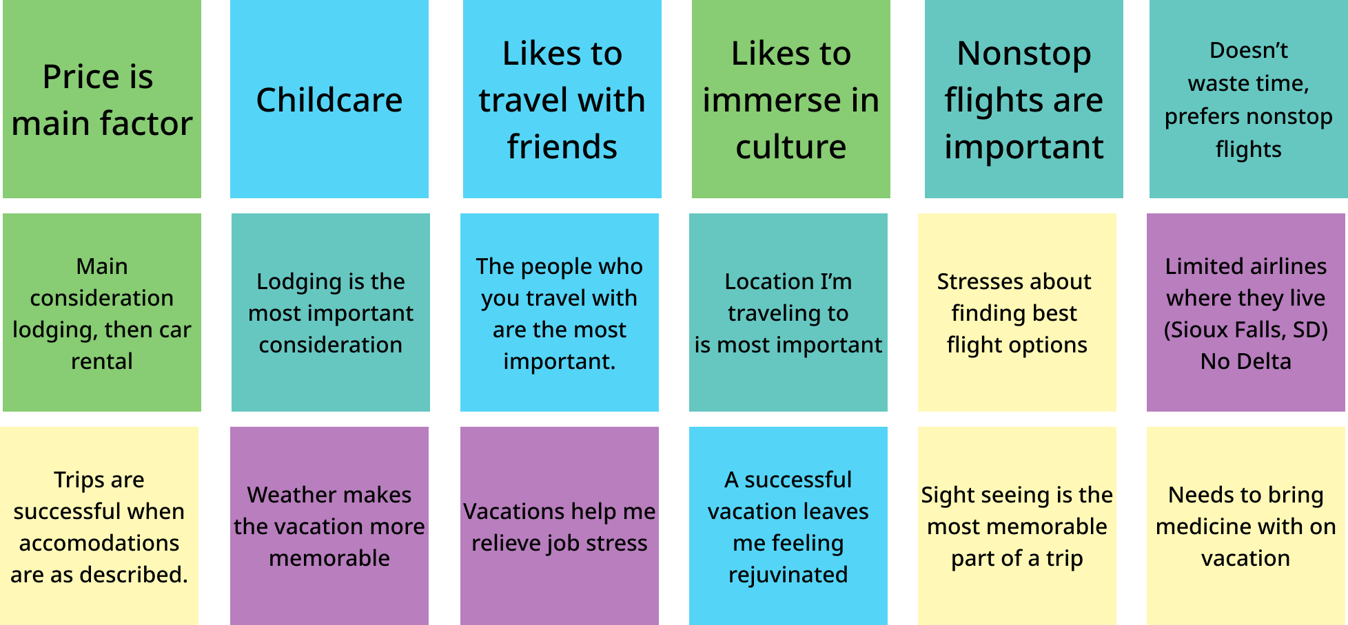
After conducting the user interviews my colleague and I began to construct an affinity diagram based on our interview notes. Since we had each completed at least two interviews with the same script, we wanted to be able to combine our findings so that we could work a solution from a larger collection of potential insights.
One of my favorite things about User Experience design is the opportunity to tell our users' stories. User centered design processes are essential to building something that satisfies users and can help meet the goals of the solution that's being created. Everything is crafted with the user in mind.
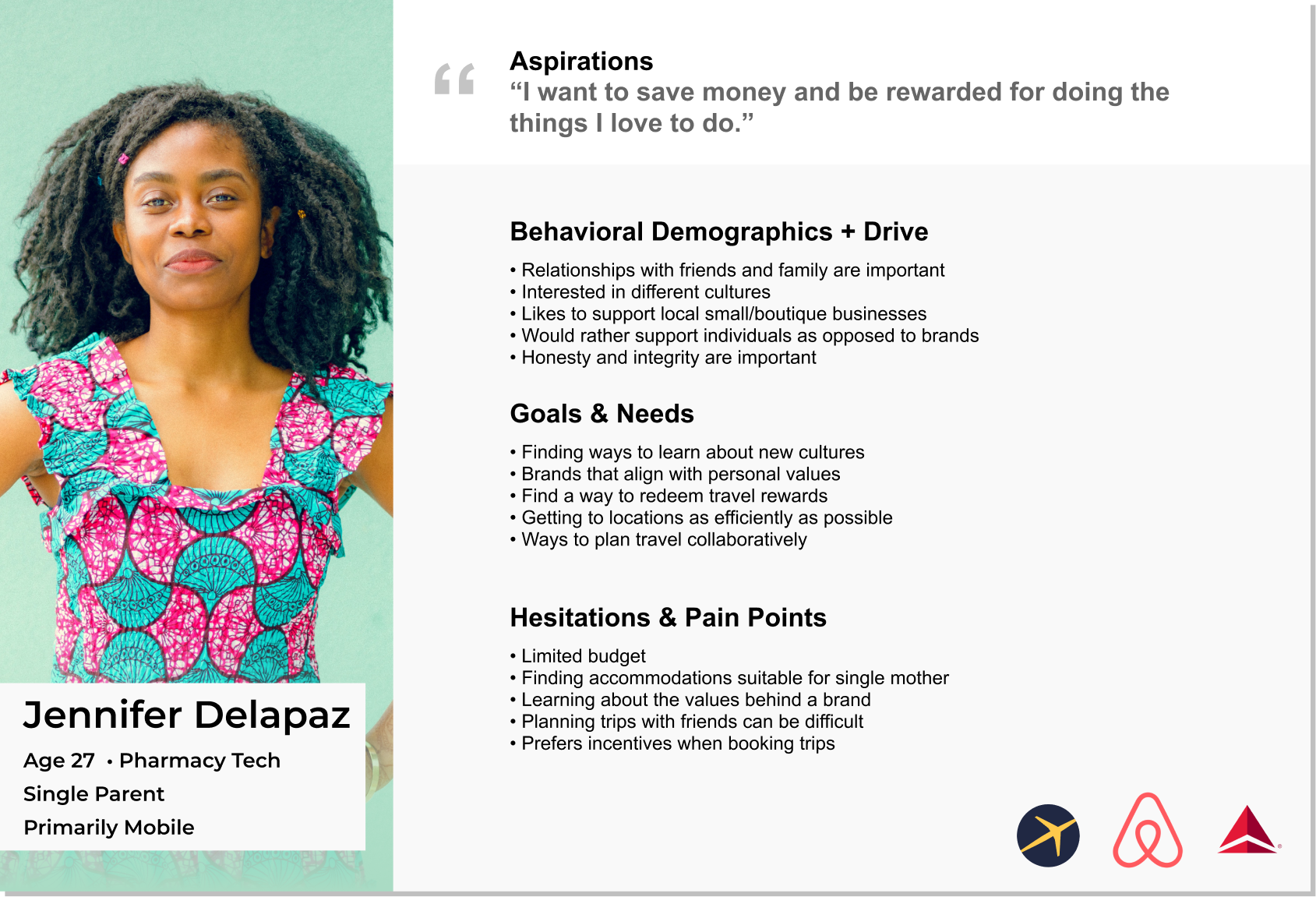
Using the insights that were developed in the interviews and affinity diagram I put together a user persona. This is an extremely important part of the design process because this is where I will anchor my design decisions. I will refer back to this at every stage of the process to determine whether the decisions that I've made are consistent with the needs of this user.
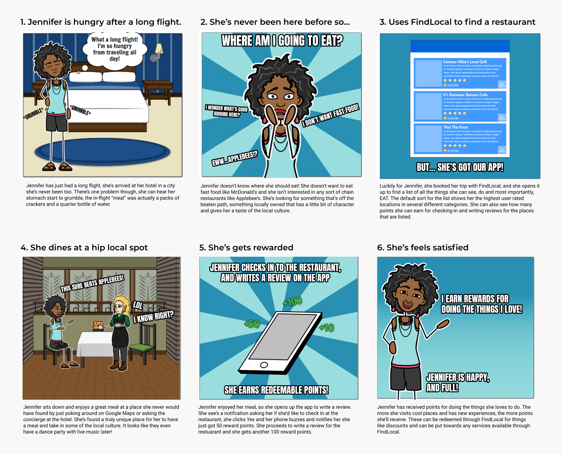
Now that I've determined who the user is, it's time to add some context to the solution. What I mean by that is that storyboards will help visualize a likely situation that my solution may be used in and what types of emotions the user may have as they experience the solution. In this case Jennifer, the user, has just arrived to her destination and she'd like to find a restaurant that is true to the local culture. We see her experiencing the application and then also being rewarded for leaving a review.
After identifying the problem and determining who the solution will be built for, I can start really thinking about how I'm going to solve that problem and work towards creating an elegant solution. This is always my favorite part of the process because it's when a good chunk of the meat is added to our initial design skeleton, so to speak.
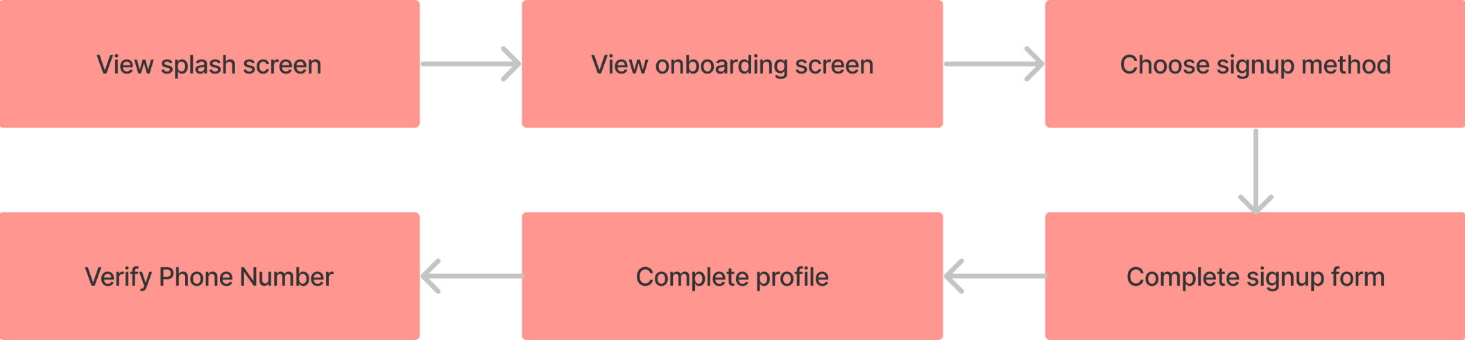
Before I begin to prototype and work with the visual identity I need to know what steps a user takes moving through the application. I think it makes sense to note that depending on the needs of different projects, the user task flows and user flows might come in earlier, but it's usually my preference to execute the task and user flows after I've done research and developed a user persona.
For this project I chose to develop the visual identity before working on prototype sketches and wireframes. Since this project was being created entirely from scratch I felt that working out some of the key parts of the visual identity at this point would be beneficial. I find that being able to to visualize how typography and color will be used makes it easier to wireframe and work through mid and high fidelity prototyping.
At this stage for this project I began to start prototyping. My process begins at a very low fidelity (sketches in this case) and works up to something fully interactive that is very close to the final product.
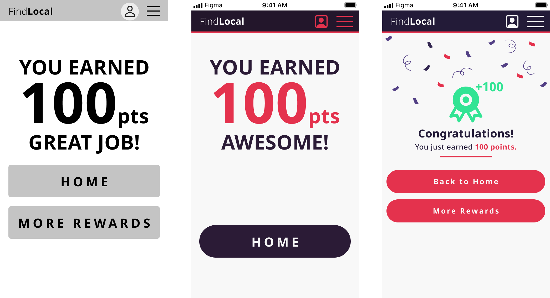
In this example of the rewards screen, you can see the progression of the screen through each level of digital fidelity. Starting with wireframes and working to mid- and finally high-fidelity gives plenty of opportunities to try new ideas and (most importantly) integrate feedback on the design. For this project I created a prototype, tested with users and then integrated their feedback into the next iteration. This keeps the user at the center of the process.

I was satisfied with with the high fidelity prototype of this design. As always though, there are things I wish I had done differently and things to improve upon next time. User interviews and research are an important part of any project, and I'm not sure that in this case the user interviews were as productive as I'd hoped. Focusing heavily on the types of questions that I'd like to ask and what insights I've gathered will be very important. Guerrilla user testing would have been preferred over my own ad hoc method in this case.